This blog will follow the journey of my freshman Foundation Design class at Moore College of Art and Design.
Wednesday, September 12, 2012
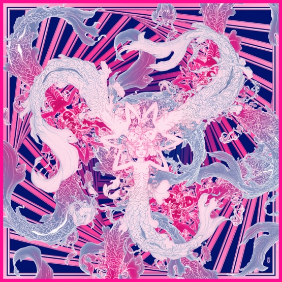
Sirens by James Jean
Sirens. Graphite & Digital, 36 x 36", 2011. .
This work focuses on a center focal point where all elements on the composition begin. The darker background creates an emphasis on the mermaid figures in the foreground. The limited color scheme creates unity within the image. Kinesthetic line of the mermaid figures create the allusion of movement. The pattern of diagonal lines in the background create rhythm and a sense of motion.
I really enjoy this piece it has a great sense of rhythm. It uses repetition of colors, figures(with slight variation) and line. The lines have a great sense of ebb and flow. This piece is very similar to the pattern designs we created in class in Photoshop.
If you are interested in seeing more of the amazing artwork by James Jean check out his website.
Subscribe to:
Post Comments (Atom)

Beautiful piece. It kinda looks like something was Photo Shopped in it though just because of the color qualities.
ReplyDelete