Saturday, September 29, 2012

The Metropolitan Museum of Art Trip Assignment

An Egyptian Peasant Woman and Her Child: 1869-70
Leon Bonnat 
Oil on Canvas
Mada Primavesi: 1912
Gustav Klimt
Oil on Canvas

Two paintings from The Metropolitan Museum of Art that I found very beautiful were An Egyptian Peasant Woman and her Child by Leon Bonnat and Mada Primavesi by Gustav Klimt. The subject of both these paintings were portraits that portrayed women but they showed them in different aspects of social class. Bonat conveys a sense of strength and dignity in mother while Klimt paints a wealthy young woman who seems to be intelligently gaze at the viewer. Both artist capture a moment which reveal the  a great sense of personality of the subject in the portraits. Both portrait were very powerful to me show two very different views of female strength and beauty.
Klimt uses line to capture form while Bonnat relies solely on value. Both painting are unified by the use of color. Bonnat use all dark and earthy tones creating a while Klimt uses bright pastels. Bonnat uses naturalism to create a realistic portrait. Distortion is used by Klimt in the background to create flowers and nonobjective designs. Both portraits use curvilinear lines to capture shape and form. In both paintings the subject of the portrait is the positive shape while the background is the negative shape.

Friday, September 28, 2012

Death And Life, 1908 by Gustav Klimt

Homework #3 Part Two


Death and Life was created by Gustav Klimt in 1908 with oil paint on canvas. This painting features an asymmetrically balanced composition the right side of the painting containing the living has more visual weight than the left with the figure of Death. The Living and Death are captured in two different shapes with various patterns. The figures in the painting are distorted giving them the illusion of motion and expression of human emotions, such as happiness and grief. There are many curvilinear forms in this painting including figures, death and the shapes which separate them. The positive shapes in this painting are Death and the living including the designs that surround them and the negative shapes is dark background. Surrounding the figures are abstracted flowers and other non-objective designs.
I really enjoy this painting because it gives an interesting view of life and death. Life is painted with figures active in bright pastels among flowers. It shows human going through life unaware that death is always close by. Death stands by statically watching the living humorously grinning at them. The figure of death is decorated with a gold cross pattern maybe suggesting this is a Christian view of life and death.

Homework #3 Part One


Chapter 5/8: Balance/ shape and Volume:
  • Describe the difference between balance and imbalanced work?
Balance in a work is equal distribution of visual weight. Imbalance in a work is unequal distribution of visual weight. Balance is usually a goal for most artistic compositions but some artist create imbalance intentionally. An imbalanced composition can cause uneasiness in the viewer.
  • What is horizontal and vertical placement?
Horizontal placement is created when an image is balanced by the element on the right and left side.
Vertical placement is created when an image is balanced by the elements on the top and bottom.

  • What is symmetrical balance, and give an art historical example?
Symmetrical balance is when elements of a design are repeated down a vertical axis.
An art historical example of symmetrical balance is Leonardo DaVinci's Vitruvian Man.

  • How can asymmetrical balance be achieved with value/color/ shape and texture?
Symmetrical Balance can be achieve within a design value, color, shape and texture by including objects that are not similar but equally visually interesting.
  • What is radial balance?
Radial Balance is a type of balance where all elements radiate from a central or circle from on point.
  • Give a good example of a piece of artwork?
An example of artwork that had radial balance is a mandala because it has a design where all elements circle out of the center of the design.
  • What is a shape and how does it differ from volume and mass?
Shape is a visually perceived area created by line, color or value. Shape differs from volume and form because it is a 2 dimensional; form and does not have volume or mass
  • What is the difference between naturalism and distortion in art and design?
Naturalism is a use portions of shapes to create a realistic image. Distortion is the exaggerated of shapes to create an expressive effect.

Define abstraction: How is your fire and water panel abstract? What concepts are informing your work on this project?
Abstraction is simplifying shapes to a basic form not including details.

My fire and water panel is abstract because is visually simplifying and stylizing fire and water to make is non-objective forms and designs.
The concepts inform my work on this projects are the natural state of water and fire and a battle between humans and nature.


Chapter 8: Shape and volume:
Define these terms in art:
  • Non-objective
Non-objective is shapes forms or lines that do not depict subject matter.
  • Curvilinear
Curvilinear is any form create with curves.
  • Rectilinear
Rectilinear is a form created with straight lines and angles
  • Positive and negative shapes
Positive and negative shapes are solely based on placement and format. Positive shapes are in the foreground and negative shapes in the background.  Figure is positive space and ground is negative space.

Chapter 10:
  • List three ways to depict illusion of depth
Size is used to depict the illusion of depth because object get smaller as they become further away.
Overlapping is used to depict illusion of depth because a shpe hide part of another shape showing it is closer.
Atmospheric perspective is an illusion of depth that use the color of value depict depth because color, value and form become obscures as they rece
  • What is one point perspective?
One point perspective is perspective created with one point placed on a horizon line all objects recede into the one point on the horizon.
  • Two point perspective?
Two point perspective e is perspective created with two points placed on a horizon line all objects recede into the two points the horizons.                                                                      
  • What is an isometric projection/?
Isometric is showing depth without foreshortening or converging lines but shows dimensions of a shape.
  • What is equivocal space? Find an example
Equivocal space is the cover by objects overlapping.
An example of equivocal space is the space where a bowl cover the view of the fruit in a drawing of a bowl of fruit.

Saturday, September 22, 2012

Fire and Water Panel Visual Research


I have begun a new project in 2D Design the Fire and Water Panel. It is exciting to begin a a large scale project. This is the visual research I collected from magazines. I found all pictures had various aspects of either fire or water.  

Friday, September 21, 2012

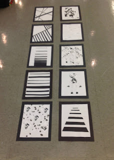
10 abstract Non Objective Layouts

Chaos and Control

Asymmetrical Balance

Textural Pattern

Dynamic Tenision
Mood #1: Calm
Anthropomorphism

Depth

Gradual Transition from Black to White

Mood #2: Angry

Ebb and Flow

These are my 10 lay outs that were hand made with cut paper and line and mark patterns and touched up with markers. The image shown above were all cleaned up in Photoshop. 

Many steps of this process were frustrating to me especially using the rubber cement to glue down my designs. The small pieces kept ripping or getting lost in the process. Editing the design in Photoshop was the my favorite part of the process it improved my design so much. Also what were learned in class refreshed my memory of tools I had learned in Photoshop a few years ago.


4 Quadrant Optical Design

Drawing the optical patterns were very difficult for me. I must have started over 3 times. I just kept making mistakes!  But after a few hours and a growing pile of crumpled paper balls, I was finished.
I feel very unsure about my final designs.

Art Quote of the Week

"The act of creation is a kind of ritual. The origins of art and human existence lie hidden in this mystery of creation. Human creativity reaffirms and mystifies the power of 'life."-Keith Haring

This quote is very powerful to me and as an artist myself I can relate. The Creation of art is an essential part of my life. My own creativity allows me to make artwork to express my ideas and to tell stories.

 The ritualistic qualities of art are have become more apparent in 2D Design class. Creating design repeat in repeat is very similar to a ritual. Creating non-objective art is very mysterious because I never know how others will interpret my designs. 

Wednesday, September 12, 2012

Patterns Patterns Patterns!!


In Foundation Design Studio last week I spent most of my time gluing down my designs, the process was slow and this frustrated me! I was excited to be finished and you can see the product of my hard work above. Well some of the were changed slightly with marker. I will upload the final designs soon.

The last in the photo set was a design I really liked created by Shannon.

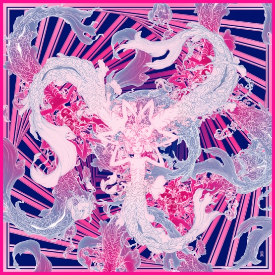
Sirens by James Jean


Sirens. Graphite & Digital, 36 x 36", 2011. .

This work focuses on a center focal point where all elements on the composition begin. The darker background creates an emphasis on the mermaid figures in the foreground.  The limited color scheme creates unity within the image.  Kinesthetic line of the mermaid figures create the allusion of movement. The pattern of diagonal lines in the background create rhythm and a sense of motion. 

I really enjoy this piece it has a great sense of rhythm. It uses repetition of colors, figures(with slight variation) and line. The lines have a great sense of ebb and flow. This piece is very similar to the pattern designs we created in class in Photoshop. 

If you are interested in seeing more of the amazing artwork by James Jean check out his website.


Homework 2

What is a focal point and list three ways to achieve it?
A Focal Point is an emphasized element in a piece of art which causes the viewer to look closer or focus on. A focal point creates an emphasis on a specific subject in the content of the work.

A focal point can be achieved by contrast, isolation,  and placement. Contrast occurs when one element differs from the other therefore it visually interrupts the pattern within the work attracting the eye.  Isolation is a contrast in placement, the emphasis is achieved by moving the subject away from the others in the work. Placement the artist places the subject within a key point in the composition to create emphasis.

List at least three types of rhythm and explain how it can help unify a piece of art?
Visual Rhythm is a design principle based on repetition of patterns, which are the same only slightly modified. The repetition of elements within visual rhythm unifies a piece of art .

Rhythmic repetition of shapes  and their arrangement creates rhythm within a artwork. Repetition of shapes and arrangements creates a connection or flow unifying the piece.

Alternating Rhythm is successive patterns of the same elements repeated in a regular order. The order of repetition unifies the artwork.

What is kinesthetic rhythm?
Kinesthetic Rhythm is when a visual experience stimulates one of the five senses. 


What is the definition of a line?
Line is a one dimensional point that is set in motion.

Contour
Contour is visual boundaries between shapes.

Gesture
Gesture is line that shows actions or dynamics and shapes are less important.

Implied line   
Implied line is is placing points which the eye tend will connect.

Explicit line
Explicit Line is line that contours figure and objects.

Lost and found line
Lost and found line is a line that define some contour then disappears the rest of the image is suggested by imagination

Line as direction
Direction in line can imply mood. Horizontal lines are calm,Vertical lines suggest a potential of motion and diagonal lines imply motion.

Psychic Line
Psychic lines are lines created mentally in a work of art.

Line as texture and pattern
Various lines can create texture and pattern in a work of art.

Sunday, September 9, 2012

Gestalt Principles Applied in Design

"Wherever you gain your inspiration, it’s often not just the particular element that sparks your artistic impulse; it’s the totality of the element and its surroundings.
Grasping that totality concept — both the individual element and the whole in which it exists are important both separately and together — is essential to understanding how gestaltism influences our design choices." - Mark Tuck
The Gestalt Principle is one way to achieve visual unity. Creating a Unified Object is extremely important to designers and artists. 
This article focuses on Gestalt Principle and how it relates to creating harmonious web designs. It uses graphic and web design examples to explain the the Gestalt Principles. This article is very helpful and ideas mentioned can be applied to all forms of art and design. 
Read the whole article HERE!


The Artwork of Marjane Satrapi


In Marjane Satrapi's autobiographic graphic novel Persepolis she tells the story of her childhood growing up during the the Islamic Revolution in Iran. Using a simplistic art style Satrapi creatively tells the story. Repetition if images is used to create striking patterns with images that flow seamlessly throughout this graphic novel. 


Tuesday, September 4, 2012

Creating Abstract non-objective layouts.


This was the first day of making Abstract non-objective layouts. The layouts were created by hand using lines and marks created in the class before. The pictures above show my messy work space.