Monday, October 29, 2012

LITTLE VOYAGEUR (2012) BY RAY CAESAR (Homework # 4 Part 2)


LITTLE VOYAGEUR (2012) BY RAY CAESAR  

Little Voyager was created by Ray Caesar in acrylic and digital media on panel. A pattern is used on the girl's coat and the pattern is defined by a grid. A texture is used in the background creating a foggy and dark landscape. All the texture in this piece is implied texture because is a digital media print. Value contrast is shown in this piece by the use contrasting values in the foreground and less dramatic changes in value in the background. Emphasis is created by te light from the pipe that creates more contrasting values. Chiaroscuro is used throughout the picture especially to create the volumes of the girls face and body. Atmospheric perspective is used to show the distance of the landscape from the viewer compared to the closeness of the girl.

Saturday, October 27, 2012

Art Quote of the Week

Andy Warhol
Nico & Andy Warhol as Batman and Robin


“Don't think about making art, just get it done. Let everyone else decide if it's good or bad, whether they love it or hate it. While they are deciding, make even more art.” - Andy Warhol 

I like this quote because it shows a more spontaneous method of creating art without an actual concept or feeling you want to evoke in the viewer in mind. In Foundation Design we create design within a certain criteria some which should display create a certain feeling and others which do not. 

When I create personal artwork I usually don't think about what others will think if they will like it or not until I am finished but I do think about a story or a concept behind the artwork. I have been given negative feed back for some of the content of my personal artwork but I try not to let this affect me. I won't change my vision. 


Homework #4 (Part 1)


Chapter 9:
1. Describe three ways to define a pattern in art or theory?
Three ways to define pattern are a repetition of a design, a repetition of actions or habits and template to create something.
2. How can a grid help to define a pattern?
A grid can help define a pattern because many patterns are created on a grid so the are balanced and ordered.
3. Describe the similarities and differences in pattern and texture?
The similarities between pattern and texture are they both are repeated but texture usually not  repeated perfectly. Texture and pattern are also different because is texture has a sense of touch while pattern is just meant to be visually interesting.
4. How can texture be used to create visual interest?
Texture creates visual interest because it appeal to our memory of touch we image what it feels like even though you can not touch it.
5. 5. What is the difference between actual and implied texture?
Actual texture is texture of a surface that can actually felt.
Implied texture in contrast is created visually and can not be felt.
6. How do you define collage? Give an example
A collage is an art work created by gluing colored, textured paper, cloth and various materials to create a design.
An example of a collage is Romare Bearden’s Patch Work Quit.


7. What is tromp L’oile? (French term: fool to the eye)
Tromp L’oile is a style of art which the artist uses realistic, texture, color and value to creat and image that is so realistic it fools the eye.
Chapter 12:
1. Define Value and a value scale
Value is the term used to describes dark and light. The value scale is a scale seven values of grey created with only mixed  black and white.
2. What is achromatic gray?
An achromatic grey is a grey created only with mixtures of pure black and white.
3. What is a Value contrast?
Value contrast is the differences and similarities between dark and light.
4. How do you create balance in a composition with value?
To create balance in a composition with value there must be a balanced distribution of values and visible contrast in values.
5. How do you create emphasis with value, give an example?
Emphasis is created with value by the use of contrast.
An example of contrast in value as emphasis is Artemisia Gentileschi’s Judith Decapitating Holofernes.


6. What is chiaroscuro? What period in art history was the word originally used?
Chiaroscuro is using light and dark values to create the allusion of volume and depth. The word Chiaroscuro was originally used during the Renaissance to describe painting and drawing that used such techniques.
7. What is aerial, or atmospheric perspective? Give an example.
Aerial or atmospheric perspective is a way to show distance in art. Objects that are closer are in higher contrast and clearer to the eye and objects that are further away are in lesser contrast and therefore less clearly seen.
An example of atmospheric perspective is The Agnew Clinic by Thomas Eakins.

Thursday, October 25, 2012

Collaged Self-Portrait

My self-portrait collage was finally completed. The whole process was very difficult for me, I did not know how abstract to make the piece. When I learned we could make the piece realistic I changed my whole process and started over. I drew a realistic version of myself on Bristol board. I used text and photos to fill in values and shapes in the drawing. To create the more intricate shapes in the drawing I used tracing paper to transfer the shapes onto magazine paper. This all was a very time consuming process.

I am happy with the finished piece even thought I had many challenges creating it.

Monster face

Here is a picture of my self-portrait in the early stages. I looks so funny.

Tuesday, October 23, 2012

Value/Texture and Shape Collages


Here is my progress so far. I am having so much trouble on the self-portrait collage.

Friday, October 19, 2012

Art Quote of the Week

Georgia O'Keeffe

Summer Days


I found I could say things with color and shapes that I couldn't say any other way - things I had no words for.
Georgia O’Keeffe

I found this quote very interesting and relative to what we are learning in class. I am sure everyone can relate to creating artwork which expresses their emotions, emotion sometimes we don't even understand ourselves. In class we just began to experiment with Value/Texture and Shape. We will use these design concepts to express various emotion in non-objective ways. 

Thursday, October 18, 2012

Value/Texture and Shape Collages Visual Research

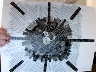
Today in design we began exploring Value/Texture and Shape by beginning to create four abstract unified lay-outs collage made of cut paper. Each layout will represent a different design concept. The concepts we must create layout for are: Radial Balance, Symmetrical Grid, Asymmetrical Grid and Abstracted Self-Portrait.

I did some online visual research to inspire my designs.

 Radial Balance
For Radial Balance I did research of bike wheels and mandala both are good examples of Radial Balance.

Symmetrical Grid
For Symmetrical Balance I researched artwork on a grid.


Asymmetrical Grid
For Asymmetrical Grid I researched Piet Mondrian and De Stijl.
Abstracted Self-Portrait
For Abstracted Self Portrait I deiced I wanted to do a slightly Cubist inspired Self Portrait so I researched Pablo Picasso and Jean Metzinger.


Tuesday, October 16, 2012

The Critique

All my work from the Critique on Thursday. I worked so hard, it is crazy to see all the work I did. I glad to be finished but I am also excited to start new projects.

Everyone did so well! The work looked amazing!

Tuesday, October 9, 2012

I did a lot of work today.

I worked hard on my fire and water panel and now I am finished!
I also finished mounting all my work.

Monday, October 8, 2012

5 tentacles

I am close to being finished. I need to draw the water and the sky.

Sunday, October 7, 2012

3 tentacles

2 more to go.
I am happy with my progress so far. There still seem to be a lot of work to do.

Saturday, October 6, 2012

Work in Progress

Here is the progress I made on my fire and water panel so far. I have a lot of work to do.

Friday, October 5, 2012